Monday 31 January 2011

Front Cover Mock Up 2 - Real Photos


Evaluation

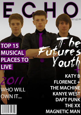
I feel this is a big improvement on the first mock up, the more information and the alignment of the text emphasises the music magazine feel. Another think that goes well is how each of the pieces of information is interconnected either by the colour or font. On the subject of colour i really like the way how ive incorporated the palette in the text, photo and title of the magazine and creates an air or professionalism.

Wednesday 26 January 2011

Double Page Spread Mock Up 1


Evaluation

Although this isn't my photo used here it is something that i would consider trying to do, but in the real world i feel to get a photo such as this wouldn't be possible in the amount of time i have. The other things on this page i like is the larger quote and the oversized speech marks. I did think at the start of having the article as a block but going back and looking at the page i feel that it doesn't have the right feel for a magazine and a music one at that.

Contents Page Mock Up 1


Evaluation 

These are all the same contents pages with a different title, I like the idea of using the big E inspired from the Vibe magazine. The problem I suffered from is i can't think of a good place to put the title that would still show the E (hence the 4 mock ups). Another thing that i feel doesn't work too well with the page is the size of the E, it does leave alot of space free on the page which makes it look more unprofessional. If i did make it smaller i think that it would loose the shape and make the E less pronounces, taking this into consideration it makes this contents page a non viable solution.

Front Cover Mock Up 1


Evaluation

What i like about this cover came about by accident, the image was too small for the A4 size paper and instead of stretching the image so it looked too distorted i graduated the bottom of the image where it was black into a solid black colour - this also makes the white writing stand out. The current problem is that it was suggested to me that it looks a bit too much like a music poster with the lack of information and centre alignment, this is however the minimalist style Im going for in my cover, so when it comes to making the final cover i will have to add something such as a puff or plug.

Article For Double Page Spread - First Draft

Title: ‘The Futures Youth’ Songs, Summer and Style
‘The Futures Youth’ EXCLUSIVE music news, cancel your plans for the summer.
Its been over two years since the release of ‘The Futures Youth’ released their debut album, ‘Nowadays: It’s too crowded’ and as the summer of 2011 comes along they have their second studio album to deliver. We got to speak with Sam Worthington, James Smith and Harry Hextall that make up ‘The Futures Youth’. We already know that the group is a real success story for unknown unsigned acts as Sam found fame and fellow band member Harry through Myspace. Their new single ‘Out for the kill’ is available from iTunes now and ‘I speak the truth when I want to’ is scheduled for the end of March, just in time for the festival season! James indicated to us that the album is more about their contribution for music and not just money driven, at Echo we totally agree with this you can see that they have incorporated their own statement style of electronic synths and bass line but add over vocals from the lead singer Sam. A track on the album we really like is ‘you only loose when you finish’ in which they collaborate with renowned female singer Katy B. But don’t be fooled the whole album is not hit club songs, their are some where we get to listen to the softer side of Sams’ voice and this makes a refreshing change the heave dub step we most commonly see. But its not just the songs that got heads turning, the album artwork is something to be admired, it has the daring of Kanye West: My Beautiful Dark Twisted Fantasy but without the nudity and numerous covers. It features the group but as you’ve never seen them before, and we will leave that as surprise until the launch date. We then got them onto the conversation for the summer, we already know they will be doing a 30 date tour up and down the country before they move onto europe in winter 2011 but what we wanted to know is if they have any plans for the summer as their tour dates a few and far between at that time. They seemed very reluctant to tell us what it was they had planned but after a bit of arm twisting and a cup of tea we got it out of them. And we can reveal here EXCLUSIVELY that it is confirmed that ‘The Futures Youth’ will be headlining at both Reading and Leeds. Will you be going? Im sure I will. We asked them how it felt to be playing at such a renowned music festival to which Harry replied ‘I couldn’t believe it, I still find it hard to get my mind round it now, but at the same time we think that our music and ourselves have come along enough to play to such big audiences’. We hope they can produce a set to rival some of the previous big headliners including ‘Daft Punk’ who in 2008 had people crowding at the main stage. One thing that we couldn’t not talk about whilst we had time with the group was their style, they are commonly snapped in the celebrity magazines as best dressed. Their smart casual look never fails to impress the masses that follow The Futures Youth, it was james that described to us why they dress the way they do, he told us that because the majority of their music is made on a computer then their is no room for error and the sound should be clean and the cleanliness is what we try emanate in their clothes. Finally I wanted to know what the future lies for them; have they started on a 3rd album?. ‘No, no third album as of yet we just want to get on the tour and then I have planned a months holiday to just relax. But after that I hope we can make another album, if the demands still their for us’ said Sam

- this is the first one i handed in and i was then given it back for some changes that i will do and the n upload the net draft 

Tuesday 25 January 2011

Editing Photos

When making my magazine i needed to edit the photos i took and then put them all on one page, to do this i used Adobe Photoshot. This is really useful especially when editing the photos as i could use simple tools such as brightening the picture and then changing the contrast but them more complex ones like spot healing and advance cutting out so that i can lay the pictures out on the page. It is also really good when putting the different things on each page as you can use layers to layer up the different sections of the page, it also means you can sort everything onto a new layer meaning that it is easy to change anything you do.


This is a picture of me using Photoshop


Monday 24 January 2011


Today I took my photos for my final magazine, to take them i used the Sony NEX-5 with a 18-55mm lens. I tried to use the 3 point lighting i have previously mentioned but found when i came to practice it was too difficult to not get any shows (i knew these would be hard to cut out later). I did keep my models the same although i did change the front man to another of the group as it made the pictures more interesting. 

3 Point Lighting

When i take my final photos Im incorporate m going to try and a technique called three point lighting, this is where you use 3 light at varuying angles and intensity. This will try to make sure there are no shadows on the subject or background. It will also then make it easy to edit and cut out the photos.

Sunday 23 January 2011

I had a look on the link Mrs Abrahamson posted on her blog for layouts of magazines and for the double page spread these two caught my eye, they are not originally what i wanted for my magazine or what i drew for my mock ups but when i have got my photos i may try and recreate the style of these.


what i especially like about this design is the letter d, i have added this into one of my mock ups and this is exactly what i meant by it. Unlike this though want the letter to cover all of the page or article and it shall be in the same colour as my palette of a dark purple. plus the contrast between the dark photo and then the clean white article page is something i now want to consider when making my double page spread.


Like the picture above, this design has the contrast in the picture and the page next to it, the special thing about this design is how the article isn't centred in the middle and doesn't fill the whole page. It adds an artistic feel about the double page spread.

Analysing Another Pitch

For my other pitch to analyse i chose to do George Hextall, from watching the animoto it was clear to me that he wanted to try and create a hip/hop rap magazine. A problem i think he would come across is; in the rap industry there is a clear divide between a stereotypical American rappers and a English rappers, the difference being that American ones are usually muscly black men whereas the English type being tall white men. A good point in his pitch was he unconventional colours, with the yellow if used correctly will make the cover stand out but it may look too unprofessional if the placing of colour is not done with care. From his pitch i didn't know what or who he was going to have on his cover, which was a problem in envisioning his magazine. His typical audience suits the style of the magazine perfectly as most rap followers are young around the 16 plus age.

Double Page Spread Mock Ups


Contents Page Mock Ups


This is styled upon the ones commonly seen in Q magazine


Whereas this is styled on the Vibe magazine style of having the first letter of its name and making a big copy of it on the contents page

Front Cover Mock Ups


Friday 21 January 2011

Group Name

After proposing a couple of ideas to my friends including; Gentlemen's Culture, International League, The Futures Youth the overall winner was The Youths Future. I myself feel this is a good name as it has a meaning to it as well as sounding modern. 

Test Shots Evaluation

I took some test shots using the three people that are going to be in my final magazine. I took these at home and tried to replicate a studio, unfortunately this didn’t, as I will describe in detail later. To take the photos I used a Cannon 1D Mark II.


 An example of one of the photos I took Is below, you can see that the golden spiral works perfectly here but the lighting cast too many shadows on their faces. I was also advised to swap the person on the left around with the middle person as he had better face for the lead. I agree with this and when I come to take my final shots I will firstly try it this way round.


Another problem witch I can see is that when I made a mock up using one of my photos there wasn’t any of my 3rd color in the photo. To change this I will either see about making the white t-shirt into a purple one or try and find purple accessories that will grab a looker’s eye.


With this mockup there are a couple things wrong, when I took the photo I was standing too close to them so when it came to putting the picture on the cover it had to manipulated so that it covered the whole page, I will need to stand further away in the future. Also the amount of content on there is too much and I should reduce this to go along with my style of minimalist. Finally I need to think about where I position the photo because on this where I have written ‘Sam Locke’ I needed to change the S and E so that it would show up.


For my DPS I decided to make the article about the groups summer, their new album and incorporating festivals. To have a photo to go along with this I took some outside with fire again I was pointed out to emphasize the festival theme I would need to add some things to the shot.


I agree with the comments made that I should add props such as a tent, beer cans and some sort of extra lights to make it feel more like a campsite, apart from this the actual photo is what I want to achieve with them having black around them but with some grass still visable.
Magazine Publisher IPC


IPC Media: The company began in 1963 and produce over 60 media brands, they claim that through their print they reach ‘almost two thirds of UK women and 42% of UK men – almost 26 million UK adults’. They have a core audience of; men, mass market women and upper market women. They own famous mens magazine NUTS and music magazine NME. Whereas for women they have abroad range from Now to TVTime to Marie Clair. The whole company is split into 5 divisions, IPC Advertising, ICP Connect, IPC Inspire, Marketforce and IPC Southbank. 

Wednesday 19 January 2011

Golden Spiral

A golden spiral is a geometric shape that when used over a photo will show you where the eye line will look at. It also will help when creating a photo or the magazine cover.


For example:

Band Profile

My group that is on the front cover and double page spread is called ‘Sweet and Sour’ they consist of 3 people from the London. The three people are; Sam Worthington, James Smith and Harry Hextall. The origins of the group began when Sam was looking through Myspace for an addition in his music, this is where he found James. A year after making music Harry approach the duo when he heard there demo tape, this was in 2008. They went on to release their first album entitled ‘Nowadays: its too crowded’ in the summer of 2009, it was an instant hit and they were regularly played on radio stations. Coming in to 2011  they are set to release their unnamed  2nd album plus they are tipped for a great success at the major festivals. 
The style of them is very casual modern and they would not look all out of place on the cover of a fashion magazine they would shop at places such as Tompman and H&M. If they were going to be compared to another group it would be something along the line of Magnetic Man or The XX as they both make music predominately using a computer which is the style of song and album Im going for a good song to relate to the artist is ‘I Need Air’ by Magnetic Man. 

Tuesday 18 January 2011

Final Name For Magazine

i have finally decided that i shall call my music magazine echo, i chose this over output as i found my friend was using this name and i didn't want to look like a copy name.

Monday 17 January 2011

Pitch Feedback

All in all I thought that my animoto went as well as it could of, the problem where I thought I was let down is my broad range of inspiration, this cropped up when I was asked about my inspiration. This then got me thinking that each issue would have a different theme to them but that theme doesn’t need to run from issue to issue. From this I then decided that this issue I wanted to go for for my coursework more of an electronic style band along the lines of Magnetic Man where they can be photographed and they don’t need instruments to show their genre or style. This then ties in with the look of the Rolling Stones of a minimalist photo.

Thursday 13 January 2011

Group Name

I did the suggestion that Mr Smith said about choosing a random article for the title of the group of my magazine. I did this, i couldnt use the first few as they were peoples names and this doesn't go when im having a group. On about the 4th attempt i got one that was suitable, Sweet and Sour.

Monday 10 January 2011

Name Change

I have previously posted that i want to call my magazine Echo but i was presented with another name that i think is as good as Echo, Output. This hass connotations with sound and the output of it. I hopt to get a final decision from my classmates when i am next in the class.

Tuesday 4 January 2011


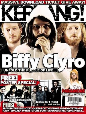
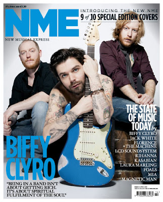
Although it does well to emphasise a certain person this cover is what i want to stay away from, the too generic look is not what i want the band to portray, also the look on their faces is not anything what i want. This is because the group I'm going to create will be a serious group.


These two covers with Biffy Clyro on continue with the theme I'm going for of a three piece band that has a main singer in this case Simon Neil, they are all standing straight and looking forward which has elements of how i want my photo to be. The first magazine cover goes even further to sow the importance of Simon because his other to members are on a sort of rubix cube and become even more distorted.


The final cover is of the same band but unlike the other all three of them are clearly seeable but you still have the sense you know Simon Neil is the leader because he is infront of the other two, id don't like the informal feel about the cover. I want to achieve a more cleaner and straight to the point image.

Sunday 2 January 2011

Magazine Prelim

I have re-visited the preliminary work we did for the magazine and look at what didn't work and what i can do to make it better next time.


i likes the colours used in this cover, i think the grey makes the cover look classy which is what i want to use in my final magazine. what i want to improve on is the font, with analysing the magazine covers i have seen that there are usually more than one font used on the cover. this adds character to the cover which i think is what mine lacks. Another improvement is that typically music magazine covers i have seen have lots of articles on the cover and over the image, so to keep in with the style of music magazines I'm going to try and incorporate this in my final piece. 


the contents page also has things i want to carry on to the contents page for the final magazine, this is the different size of font for the different pages and the right align of them. one thing that i want to improve on is the pictures, what i want to do is have picture along with the text. 

I came across this magazine with N.E.R.D and Kaws, i like the idea of using a cartoon style over real life photographs, I think it adds another level to the cover. It can also add more colour if you can't fit it in on the photo shoot.


My cover for the magazine is going to contain 3 people as a group and the way magnetic man are standing here is along the same style as i want the three people in my magazine cover to stand. I like the photo because the middle one (Skream) stands out more and for the made up group for my magazine the middle person will also be the lead singer.


More like this photo, you still have the same feeling that the middle person is the leader of the group but you can see more of the other two here than in the NME cover.

Saturday 1 January 2011

Final Colour Palette

Looking at the questionnaire i have the two main ideas for a colour palette, blue white and black or purple white and black.

I wont make my final decision now, that will come closer to shooting the images and i can see what props and clothing would suite the colour palette. 

Questionnaire Continued

The information here will help me allot when designing my magazine, such as what price to put on and the information about if they download or buy CD's more will help me if i was to include a freebee.