Evaluation
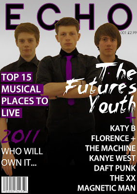
I feel this is a big improvement on the first mock up, the more information and the alignment of the text emphasises the music magazine feel. Another think that goes well is how each of the pieces of information is interconnected either by the colour or font. On the subject of colour i really like the way how ive incorporated the palette in the text, photo and title of the magazine and creates an air or professionalism.


No comments:
Post a Comment